

Color is one of the most powerful tools in home decorating. It shapes how a space feels, influences mood, and ties together architecture, furnishings, and personal style. While choosing colors can feel overwhelming, understanding a few core color principles and theories can transform the process from guesswork into a confident design strategy.
This article explores the essential concepts of color theory as they apply to interior design, and shows how you can use them to create beautiful, balanced, and livable spaces.
Understanding Color Theory in Interior Design
Color theory is a framework that explains how colors relate to one another and how they interact visually and psychologically. In interior design, it helps homeowners and designers make intentional choices rather than purely instinctive ones.
At its core, color theory considers three main attributes:
- Hue – the color family itself (red, blue, green, etc.)
- Value – how light or dark a color appears
- Saturation (or intensity) – how strong, bright, or muted a color is
Mastering these elements allows you to build color palettes that feel cohesive, comfortable, and appropriate for each room’s function.
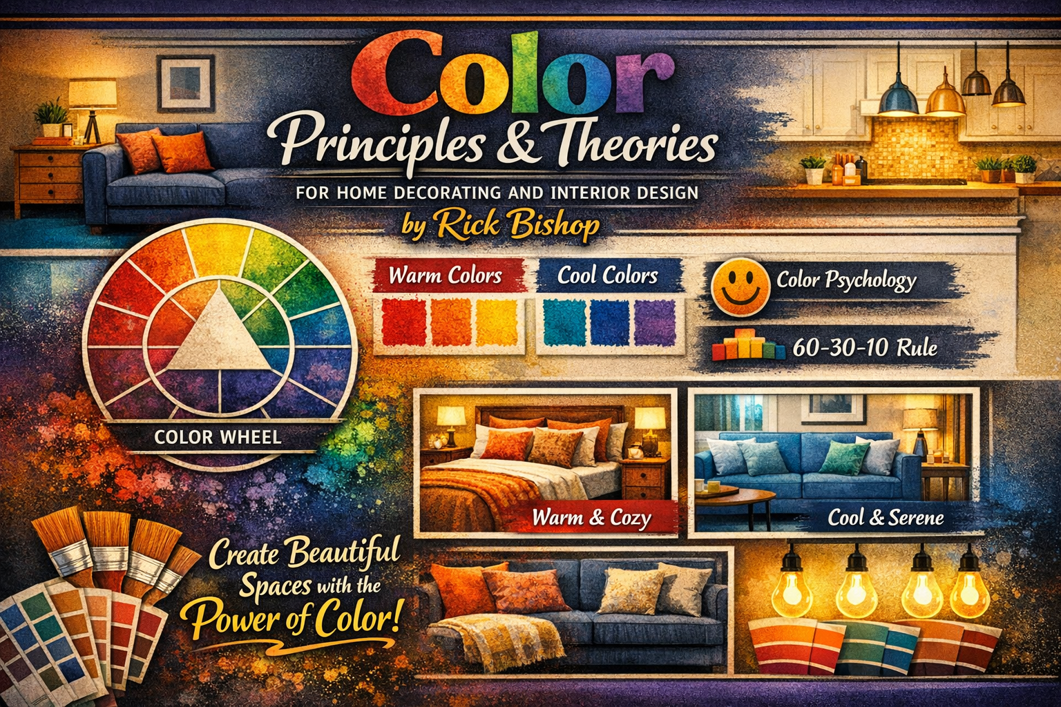
The Color Wheel: The Foundation of Color Harmony
The color wheel is the most familiar tool in color theory. It organizes colors in a circular format to show how they relate to one another.
Primary, Secondary, and Tertiary Colors
- Primary colors: Red, blue, and yellow
- Secondary colors: Orange, green, and violet (created by mixing primaries)
- Tertiary colors: Blends of a primary and a secondary color
Understanding where colors sit on the wheel helps you predict which combinations will feel harmonious and which will create contrast.
Common Color Schemes for Interiors
Interior designers rely on several classic color schemes to create balance and visual interest:
Monochromatic
Uses variations of a single hue through different values and saturations. This approach creates a calm, sophisticated look and works especially well in minimalist or modern interiors.
Analogous
Combines colors that sit next to each other on the color wheel, such as blue, blue‑green, and green. Analogous schemes are cohesive and soothing, making them ideal for bedrooms and relaxed living spaces.
Complementary
Pairs colors opposite each other on the color wheel, like blue and orange or green and red. These high‑contrast combinations add energy and drama and are often best used with one color dominant and the other as an accent.
Triadic
Uses three colors evenly spaced around the wheel. This scheme offers balance and vibrancy but requires careful control of proportion to avoid visual overload.
Color Temperature: Warm vs. Cool
Colors are often described as warm or cool, and this distinction has a major impact on how a room feels.
- Warm colors (reds, oranges, yellows, and warm neutrals) tend to feel cozy, energetic, and welcoming. They can make large rooms feel more intimate.
- Cool colors (blues, greens, purples, and cool neutrals) promote calm, focus, and openness. They’re commonly used in bedrooms, bathrooms, and home offices.
Combining warm and cool tones thoughtfully helps maintain visual balance and prevents a space from feeling flat or uncomfortable.
The Psychological Impact of Color
Color psychology plays an important role in residential design. While personal and cultural experiences influence how people respond to color, certain patterns are widely recognized:
- Blue encourages calm and concentration
- Green feels restorative and balanced
- Yellow brings optimism and light
- Red adds excitement and intensity
- Neutrals provide versatility and stability
In home decorating, these effects should guide decisions about where to use bold colors and where to rely on softer, more neutral palettes.
Value, Contrast, and Spatial Perception
Beyond hue, value (lightness or darkness) significantly affects how a room is perceived.
- Light values reflect more light and can make spaces feel larger
- Dark values add depth, drama, and a sense of intimacy
Strong contrast between light and dark creates visual interest, while low contrast produces a seamless, tranquil look. Designers often layer several values of similar colors to achieve depth without chaos.
The 60‑30‑10 Rule for Balanced Color Distribution
One of the most practical rules in interior design is the 60‑30‑10 principle:
- 60% – the dominant color (walls, large surfaces)
- 30% – the secondary color (furniture, textiles)
- 10% – the accent color (art, accessories)
This guideline helps maintain balance while still allowing room for expression and personality.
Neutrals, Undertones, and Subtle Complexity
Neutrals are not “colorless.” Whites, beiges, grays, and taupes all have undertones—warm or cool—that can dramatically change how they read in a space.
Undertones are especially influenced by:
- Natural and artificial lighting
- Surrounding materials (floors, countertops, fabrics)
- Adjacent colors
Choosing neutrals with compatible undertones is key to creating cohesive interiors that feel intentional rather than mismatched.
Lighting and How It Alters Color
Lighting is inseparable from color in interior design. Natural daylight, warm incandescent bulbs, and cool LED lighting can all shift the appearance of the same paint color.
A color that looks perfect on a sample may feel entirely different once applied to a wall and viewed throughout the day. Testing colors in the actual space and observing them in multiple lighting conditions is essential.
Bringing It All Together
Successful home decorating doesn’t require memorizing every color rule—it requires understanding enough theory to make confident, thoughtful choices. Color principles provide a framework, not rigid limitations. When combined with personal taste, lifestyle needs, and architectural context, they allow you to design spaces that feel both beautiful and authentic.
By appreciating how colors relate, how they influence mood, and how they behave in real spaces, you can create interiors that are not only visually appealing, but genuinely enjoyable to live in.